


DANIEL LI
Daniel Li
designing visual experiences, strategically
Visual designer based in Germany, telling stories, crafting identities, interfaces, and systems that resonate. I’m drawn to the space where aesthetics meet function — where a considered visual decision can change how something feels to use.
Much of my work is rooted in the media and culture sector, where I help organizations communicate with depth and intention. A background in cognitive science and UX/UI informs how I approach problems — bridging analytical thinking with visual craft.
I believe the way things look shapes the way things feel. I aim to contribute to a more thoughtful and positive connection between humans and technology.
Curious to collaborate? Let’s chat -> li.daniel@protonmail.com

MORE INFO
BACKGROUND
| PortUNA Neue Medien | UX/UI design Intranet programming department | 06/2023–04/2024 FT |
| RBB – Rundfunk Berlin-Brandenburg | production assistance Radio COSMO | 01-04/2021 FT |
| SWFR | project management International Club german-asian project team | 11/2018-10/2020 PT |
| Kunstverein Freiburg | technical support art handling artistic assistance | 11/2017-10/2020 PT |
EDUCATION
| FIGD Academy for IT and Graphic Design | certification as 3D Specialist | 08-11/2022 FT |
| FIGD Academy for IT and Graphic Design | certification as UX/UI Designer | 08/2021-08/2022 FT |
| LIMA Berlin | certification in Photoshop | 04/2017 |
| Albert-Ludwigs University Freiburg | BA Sinology & Cognitive Science | 10/2014-02/2021 |
internships
| MERICS – Mercator Institute for China Studies Berlin | internship communication department | 10-12/2020 FT |
| Roberto Sandino (Granada NI) | internship analog print workshop – La Sirena | 03-04/2016 FT |
| Gabriella Stellino (Riegel DE) | internship independent illustration office | 11/2014-04/2015 PT |
concept, strategy & management
| Impuls Crew | co-founding project management visual design | 01/2020-10/2020 |
| Subtil/Skurril | co-founding management visual design | 05/2017-10/2023 |
| Movement Motus e.V. | co-founding executive board membership project management graphic design | 12/2015-01/2020 |
selected works

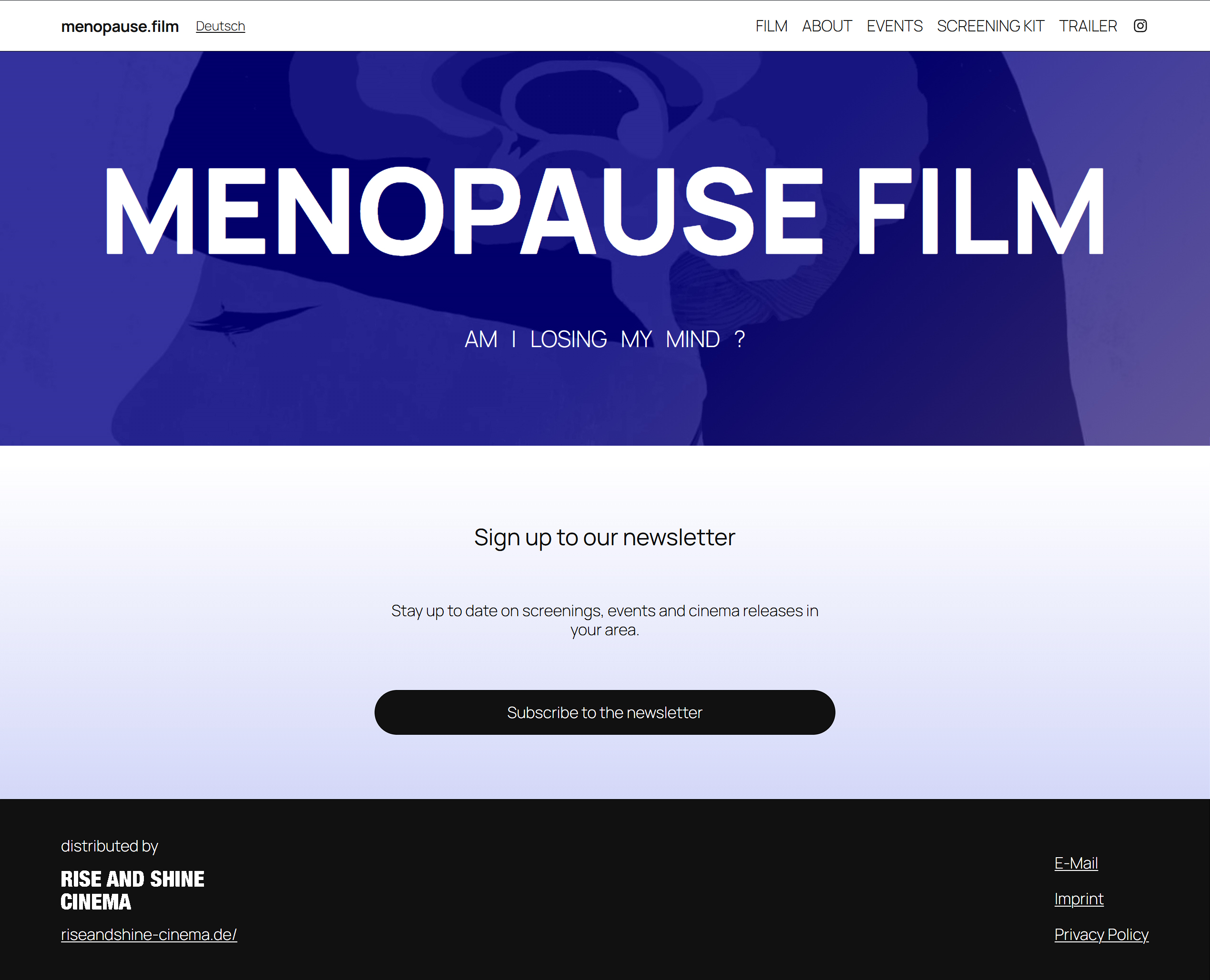
Rise and Shine – Cinema is a film distribution-company specialized in qualitative documentaries, delivering averagely four films per year into cinemas since 2015.
The upcoming release, MY NEW OLD SELF – a documentary by Louise Unmack Kjeldsen, required a clear and functional website. Intended to serve as an accessible bilingual platform for ongoing communication and engagement with the project.
MORE ABOUT THE MENOPAUSE FILM
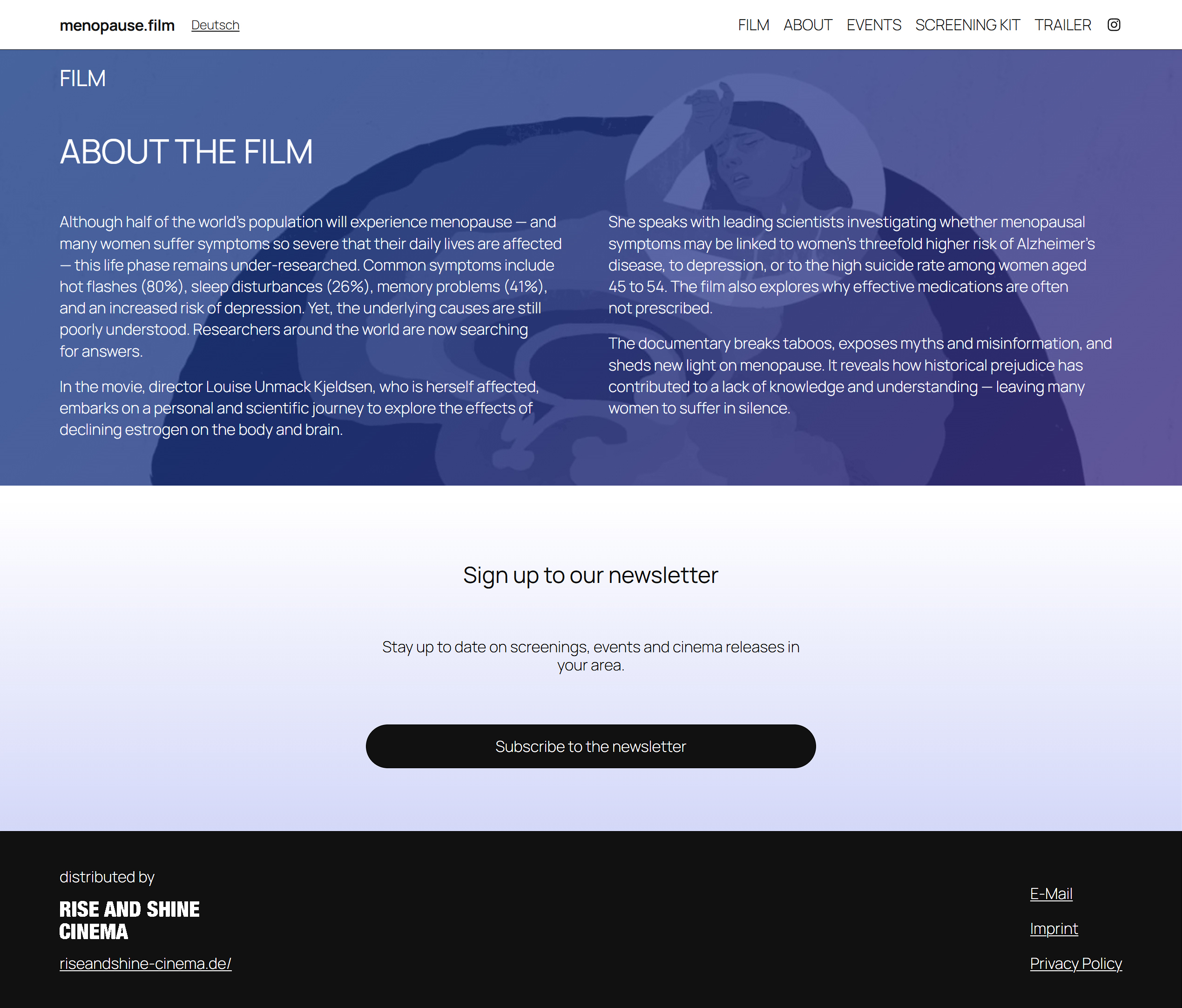
Goal
the client defined a small conceptual backlog to clarify the website’s initial scope.
Primary purpose of the site
-> Business card / Credibility / Information for the press / Cooperation partners
Content required at launch
-> Synopsis, vision & mission, team, teaser images, protagonists,contact information
Content planned for later phases
-> Trailer, festival information, screening kit download, press review, social feed integration
Language requirements
-> If so: German/English from the start? Or English as standard, with German and Danish as options?
From these insights, the following user requirements were derived:
- Users need quick access to essential information
- The site must offer a clear and easily scannable overview
- The experience should invite users to explore the project behind the scenes
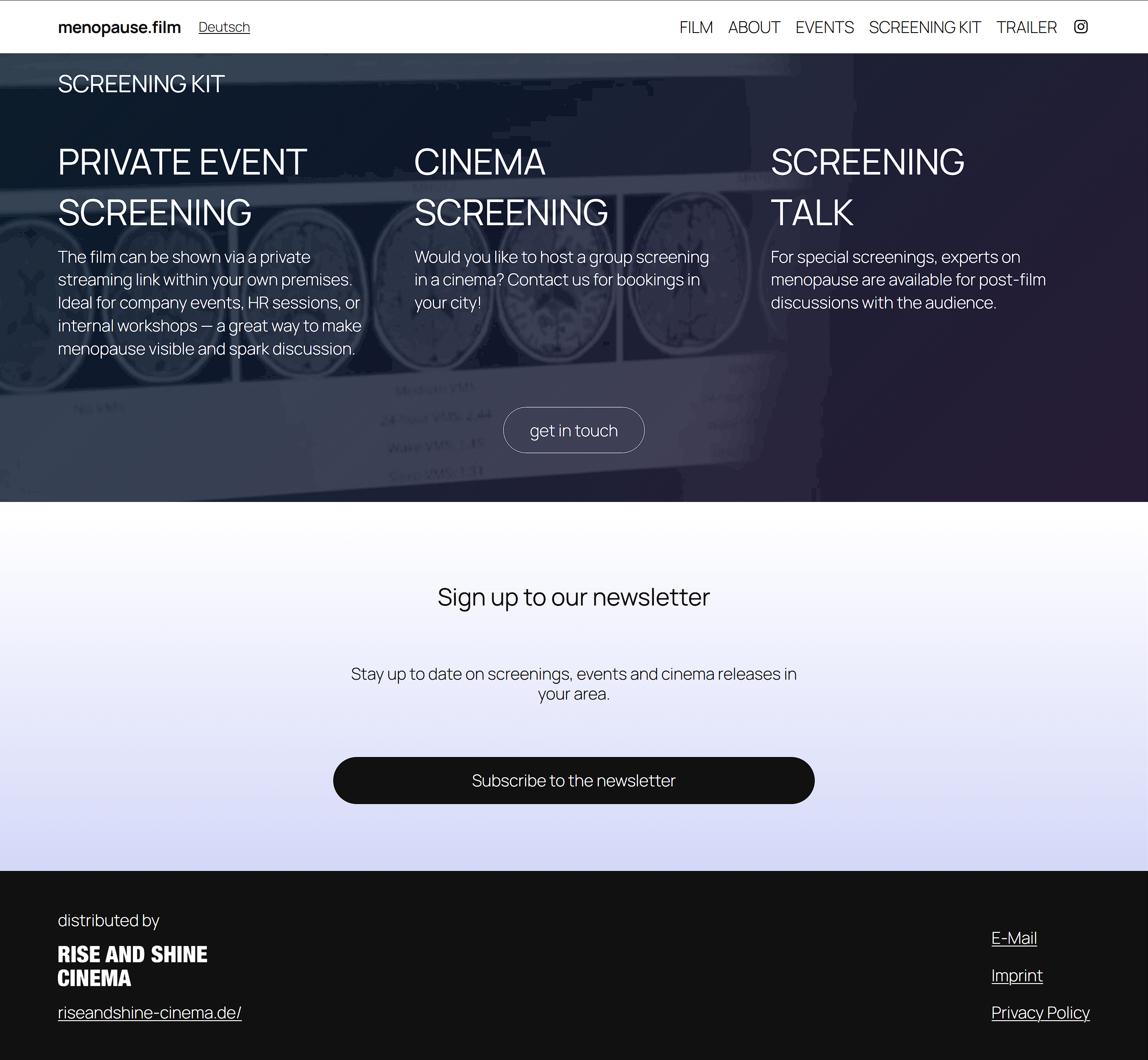
Challenges
- Conceptual: Keep an informative website engaging while addressing sensitive subject matter.
- Aesthetic: Narrate the story behind the film with emotional impact while avoiding clichés and spoilers.
- Technical: Provide two languages efficiently across the website.
Design Approach
- Minimal user interface with a consistent layout ensures fast orientation and easy access to content
- Visual and structural elements subtly invite users to explore behind-the-scenes material
- Prominent and easily identifiable language switcher, labeled in each language’s native form to support a multilingual audience


SHOOT N‘ SHRINK
UX/UI Design, Visual Design, Gamedesign
08/2024
Blender, PS & Unity, Git
Contribution for the GMTK Gamejam. Submitted by Superschnizel, Hynozia, aetheristics on itch.io —> 1 hour, 57 minutes before the deadline.
Shoot and shrink your way through your enemies in this high paced top down shooter!
Gameplay: break your enemies plasma shields and use your shrink gun to shrink them down to size so you can eat them.
MORE ABOUT SHOOT’N SHRINK
Goal
The GMTK Game Jam is one of the largest game jams worldwide, bringing together thousands of developers to create a game within a strict 96-hour timeframe. The 2024 theme, “BUILT TO SCALE” challenged 32000 participants to explore scale in creative ways.
Our initial concept focused on swarm behavior. We aimed to design a system of small, hand-animated microorganism-like entities—similar to amoebae—that would move as a clustered group through space. The idea was to let players push, pull, and guide these organisms to interact with the environment, potentially solving puzzles or engaging in destruction-based gameplay. A clustering algorithm was planned to drive this emergent behavior.
Research
While the technical exploration progressed, the concept revealed critical UX issues early on. The visual result lacked clarity, and the interaction model failed to produce engaging or intuitive gameplay. More importantly, we were unable to define a satisfying core loop—an essential foundation for user experience.
At the halfway point (after ~48 hours), I initiated a strategic pivot. With limited time remaining, we shifted our focus from innovation to clarity, playability, and completion. Our new goal became: deliver a small, coherent, and polished experience.
Insight: Innovation takes time that you don’t have in a competitive environment.
Design Approach
We transitioned to a straightforward top-down shooter in 2½D. In this redesigned concept, the player controls a mysterious character shrinking enemies in an abandoned spaceship — tying back to the theme of the gamejam.
From a UX/UI perspective, this pivot allowed us to:
- Establish a clear gameplay loop (shoot → shrink → eliminate)
- Improve visual readability and player feedback
- Reduce cognitive load and ambiguity in interactions
- Focus on responsive controls and satisfying moment-to-moment gameplay
The project was developed in Unity, with version control managed via Git on a private server. I was responsible for visual design and asset creation in Blender, integrating and refining them within the engine.
Outcome
While not at the top, the result reflects a successful recovery from an initially over-scoped concept to an exciting, playable experience. The project demonstrates pragmatic decision-making and a user-centered approach under extreme time constraints.
Out of 7527 submitted games, ours ranked: Overall #3689 and #3200 in the Enjoyment criteria (based on 21 ratings)
A standout moment was the integration of the soundtrack, which significantly enhanced the overall user experience—elevating emotional engagement beyond expectations.
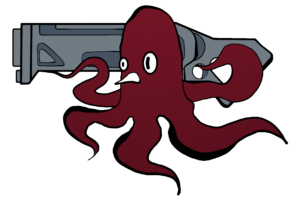
Phlegma
Logo Design
07/2024
Blender

WOOF WEAR
Logo Design
07/2024
Illustrator
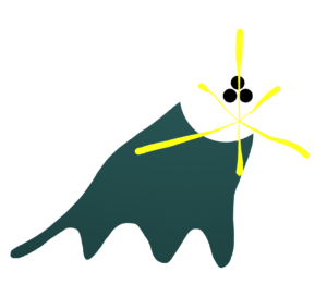
DEADLY JOKE
03 / 2023
Graphite & Photoshop
VFX loop
02 / 2023
Blender
AE/TV Lightpath
02 / 2023
Blender
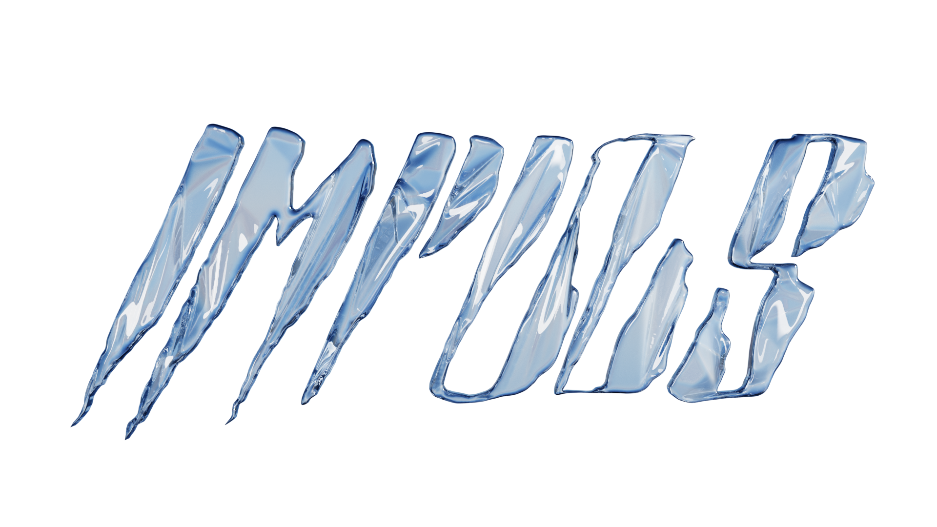
IMPULS
Visual Design
12/2022
Ink, Photoshop, Illustrator, Blender
This is made for the Impuls Crew, a DJ and event collective I founded with friends back in the day. Since then, the Impuls Crew organizes electronic music events like the Rempart Rave in Freiburg with considerable success.
Since I had already designed the collective’s logo, I created this as an additional visual asset for their communications.
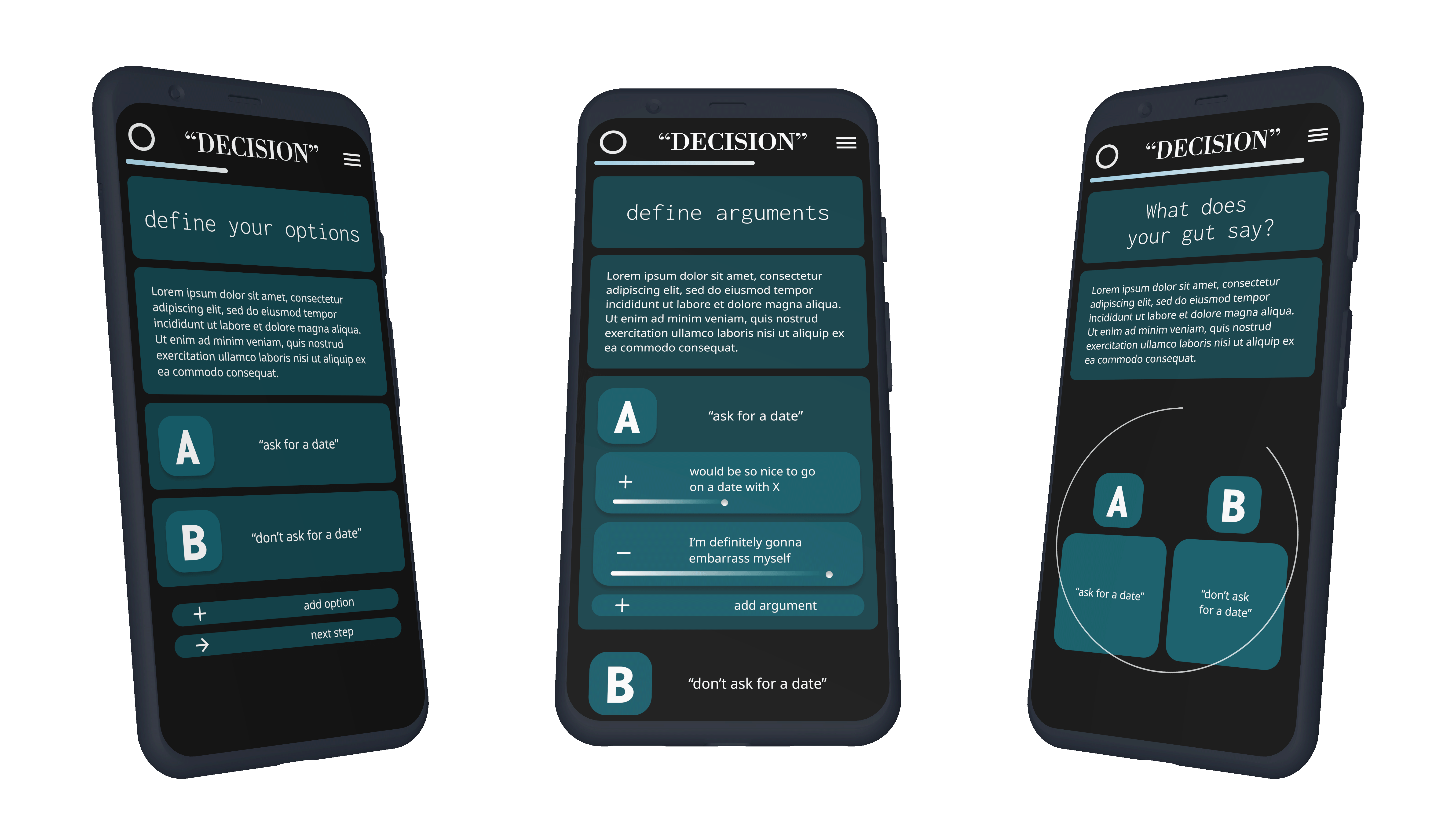
The Decider
Conception, UX-UI Design
07/2022
Figma
Decision Support System, working as thought-reflection interface. Designed to help users discover their true opinion by supporting rational thinking and enhancing intuition.
MORE ABOUT THE DECIDER
Goal
Design an interface that helps users:
- Structure their thoughts
- Balance rational and intuitive decision-making
- Reach clarity with minimal cognitive load
The key challenge was to create a system that is both analytically useful and intuitively usable.
The idea originated from a personal observation: friends and family often consulted me during their decision-making processes. Since decision-making is inherently difficult, I explored existing decision support systems (DSS). I found that many available apps either lack usability or suffer from poor interface design. In addition, their underlying logic is often not transparent, making them hard to trust and understand.
From this, I concluded that the key challenge for such a product is to balance efficiency with intuitive usability.
Research
During my studies in cognitive science, I had already explored human decision-making in depth. This background helped me break down the complexity of decision-making into smaller, actionable components.
Decision-Making Models
Humans generally rely on two approaches when making decisions: rational and intuitive. Both come with distinct strengths, limitations, and influencing factors.
Rational decision-making
+
only if an optimal solution is possible
fact driven approach: minimizing biases, enhancing objectiveness
–
not a very human approach
due to our lack of cognitive capacities and optimization
(motivation ends as soon as a sense of satisfaction is reached -> no ongoing optimization)
time consuming
limits of information / knowledge / anticipation
quantity, quality, accuracy and integrity of information are often missing
cause-effect relationships are not clearly discernible
Intuitive decision-making
+
good for low value decisions
speed
a certain degree of intuition is required
(more difficulty in decision making -> less intuition).
ability that can be improved through learning
–
inaccurate, insufficient, unreliable and unrelated information is indistinguishable
inappropriate application possible (example: overconfidence)
short term emotional bias
(even experts can be influenced by unrelated emotions)
bias due to prejudice (example: lack of openess)
insufficient consideration of alternatives – limits of information
(intuition relies on pattern-recognition -> limiting options)
heuristics and habits
To design an appropriate decision-making strategy, several key factors need to be considered:
Time
How much time can be invested in the decision-making process? More time -> more effective analysis of situation possible. (Risk of overanalyzing -> analysis paralysis.)
Value
Importance of the decision result. Higher value -> requires more consultative / collaborative approach.
Quality
How to define the optimal solution? Is a satisfactory outcome sufficient, or is maximization/optimization of the solution required? (Risk of moderate solution bias, criterions for quality could be: level of action, social harmony, self-actualization.)
Commitment to implementation
Are the options of the decision realistically implementable? -> Many decisions fail at this point because the acceptance / commitment is too low.
Relationship impact
If the decision is embedded in a social context -> decision-making approach should include social factors.
Complexity
Are the options imaginable without additional help? Is the decision comprehensible?
Biases
Both deicision-making approaches contain sources of bias -> How to deploy bias filter?
Objectives
What is the motivation behind the decision? A decision that deals with the fear of losses is something completely different from a decision about possible gains.
Uncertainties
Always play a role. The question is which.
Insight: An efficient decision support system provides structure and guidance, helping deciders to interpret their own thoughts iteratively.
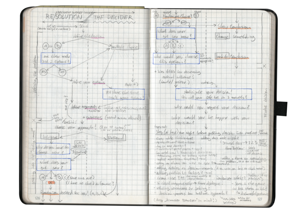
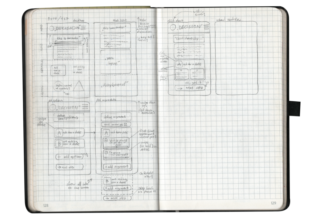
User Journey Design Concept
With my theoretical findings in mind, I began to design a process for my app that incorporates both rational and intuitive decision-making approaches, as well as methods for filtering biases.
The Decider translates complex decision-making into a guided, step-by-step interaction flow:
The decision-making journey is structured into three key phases:
1. Frame the decision
The process begins by framing a decision as a clear question.
Users define their problem and clarify whether it’s binary or multi-option.
2. Structure options & arguments
Frame the decision
Users define their problem and clarify whether it’s binary or multi-option.
Structure options & arguments
- Define possible choices
- Assign pro and contra arguments
- Weight arguments based on importance
3. Reflect & reevaluate
Users review their inputs in a structured format, enabling a more objective perspective.
To counter cognitive bias, the system introduces small interventions—such as prompting users to reconsider missing alternatives in binary decisions.
4. Decision Flow
Users can choose between an intuitive or rational decision-making approach, depending on their situation and preference.
Intuitive Approach
The intuitive path begins by validating whether the decision can realistically be made—ensuring that sufficient and reliable information is available.
If so, users are guided into a rapid, instinct-based interaction. They are asked: “What does your gut say?” while all defined options are displayed. After a short delay, a 10-second countdown appears as a shrinking visual indicator, encouraging a quick, emotional response.
During this time, an option to indicate complete uncertainty gradually appears. Regardless of the user’s input, the system then transitions to a resolution screen:
“No problem—I decided for you.”
At this stage, the app presents the rationally optimal option, calculated by comparing the weighted arguments and selecting the strongest overall choice.
Users can either accept this suggestion or repeat the intuitive process if the result does not feel right.
Rational Approach
Users who choose the rational path are directly presented with the calculated optimal solution, based on their structured inputs and argument weighting.
5. Reflection & Validation
After making a decision, users enter a reflection phase. They are encouraged to consider both positive and negative consequences of their choice—across the near and distant future—and optionally document their thoughts for later reevaluation.
To support better long-term outcomes, the system suggests revisiting the decision after some time (e.g., “sleeping on it”), especially for high-impact choices. If the decision continues to feel uncertain or uncomfortable, users are encouraged to repeat the process.
For decisions that are ready to be acted upon, users are guided toward execution—optionally transitioning to a companion tool called the MOTIVATOR.
Design Approach
Once the interaction flow was defined, I translated the concept into wireframes, focusing on clarity, guidance, and reducing cognitive load throughout the experience.
The design focuses on:
- Clarity over complexity
- Guided interaction instead of open-ended input
- Reducing cognitive load through step-by-step flows
- Making reasoning visible and comparable
The interface acts less like a tool and more like a facilitator for thinking.
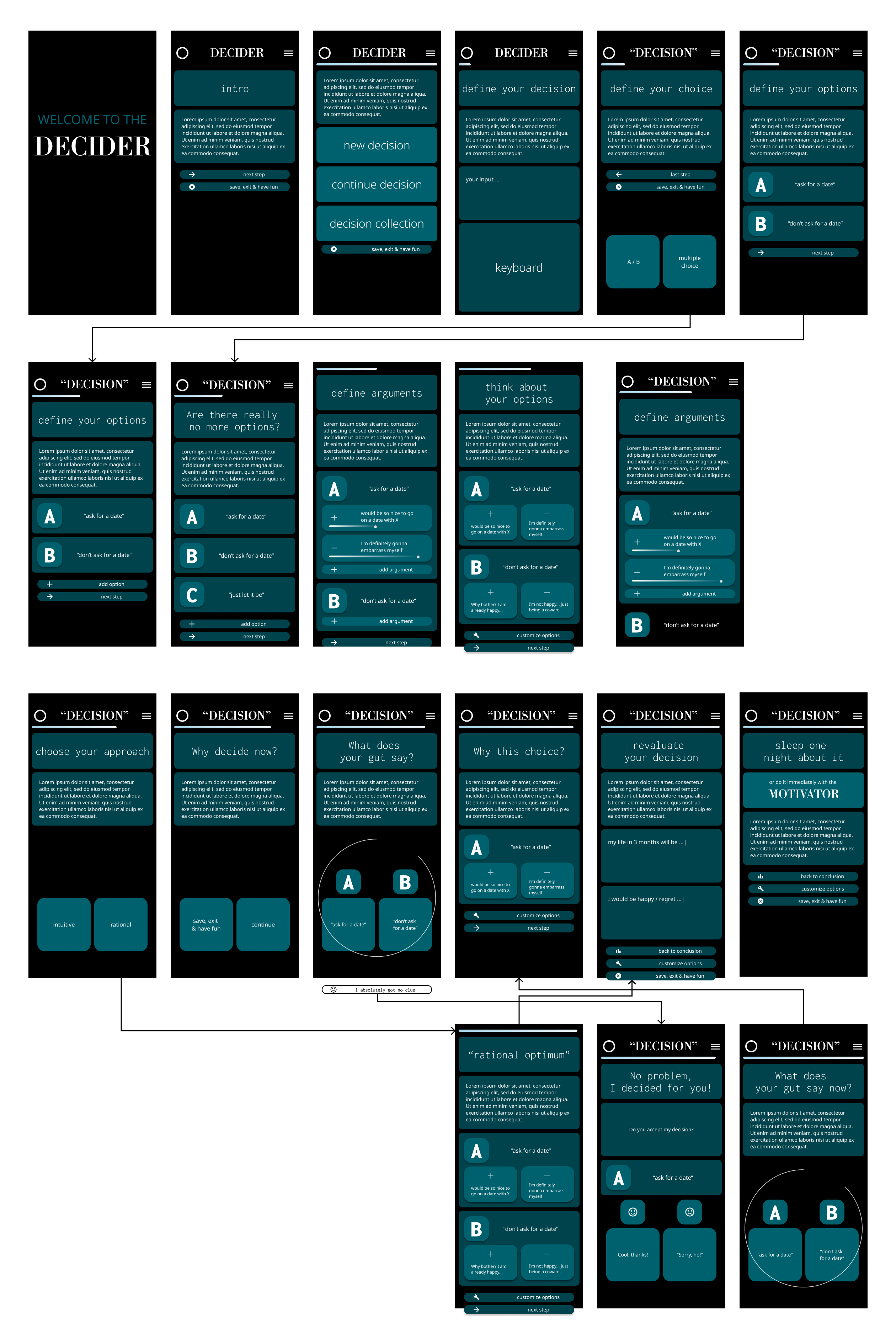
Outcome
The result is a lightweight decision-support experience that:
- Encourages self-reflection
- Makes abstract reasoning tangible
- Supports both intuitive and rational thinking
Instead of giving answers, The Decider helps users arrive at their own—with more confidence and clarity.
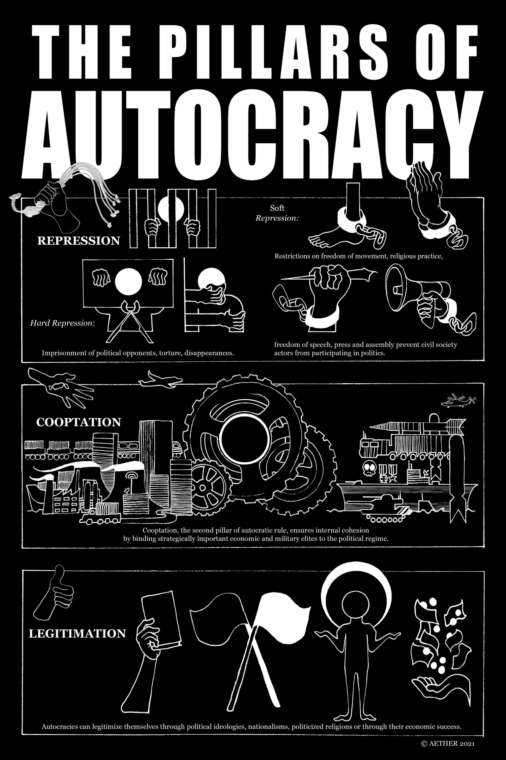
THE PILLARS OF AUTOCRACY
Graphic Design / Illustration
05/2021
Graphite, Ink, Photoshop
I sought for a compelling subject for an infographic and couldn’t resist the idea to illustrate the Pillars of Autocracy by Johannes Gerschewski.
More about this here:
Die drei Säulen und das Überlebenelektoraler Autokratien – Eine Replik by Gerschewski, Johannes (2017) in Zeitschrift für Vergleichende Politikwissenschaft 11(2), 237-246
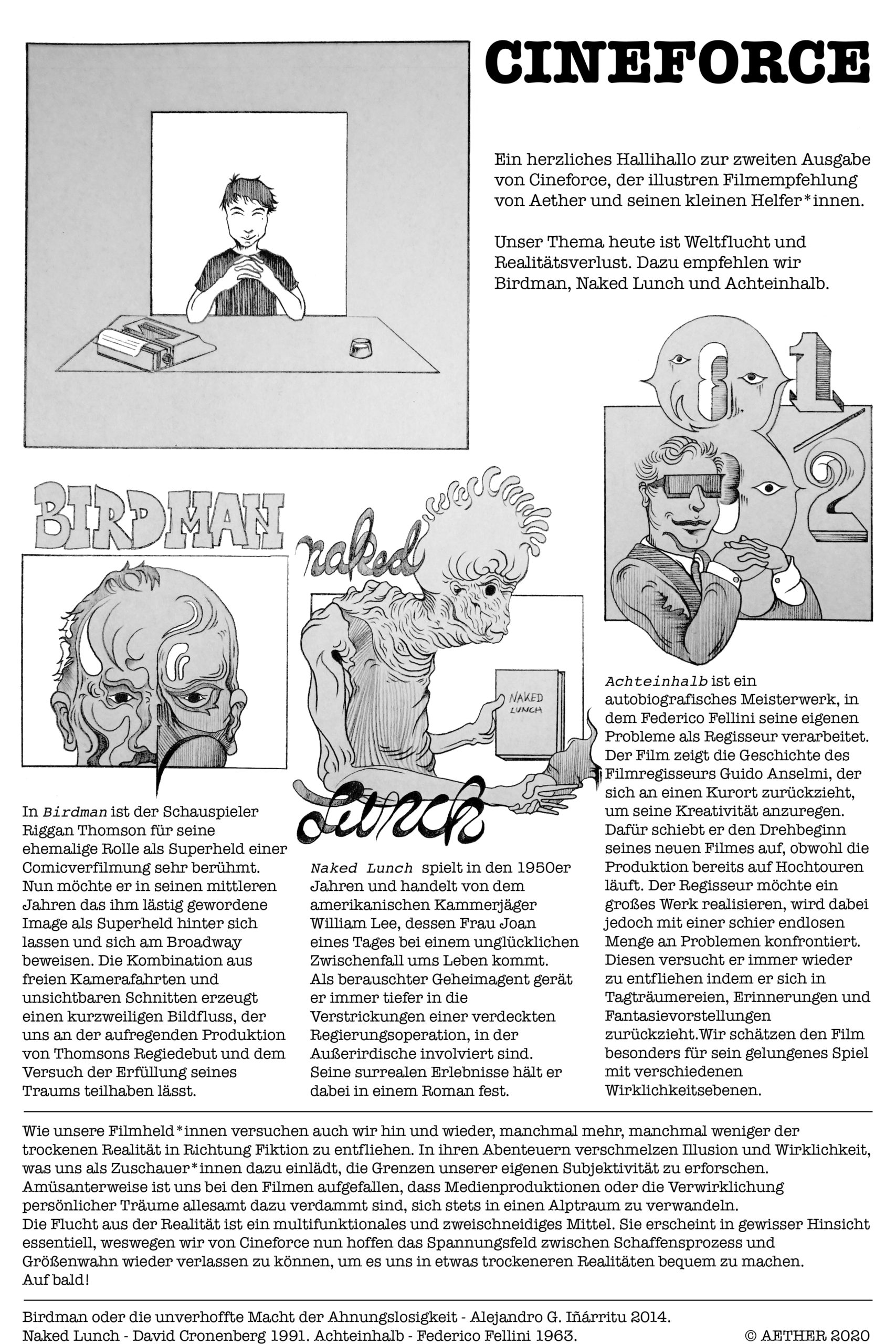
CINEFORCE
Concept, Visual Design, Illustration
05-07/2020
Graphite, Adobe Photoshop
Cineforce was a biweekly illustrated film recommendation series published online by the International Club of the SWFR and Subtil/Skurril.
MORE ABOUT THE CINEFORCE
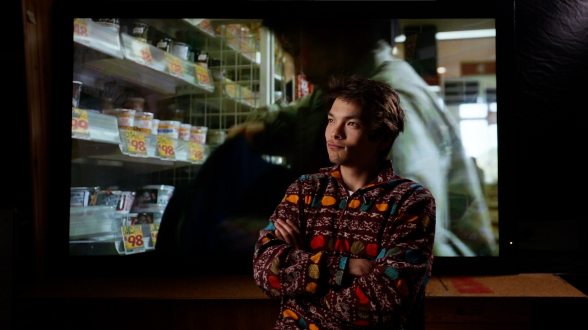
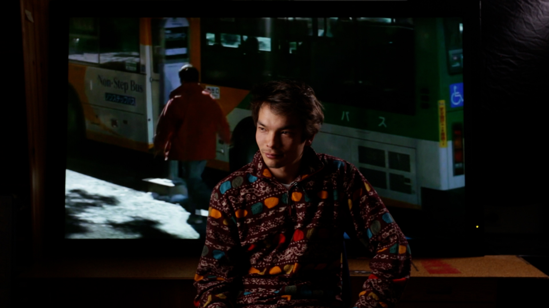

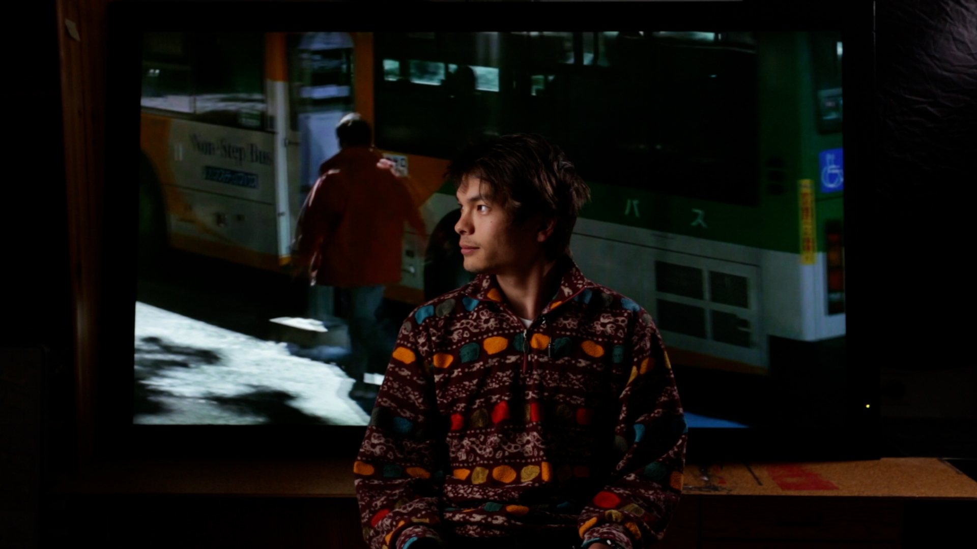
At the onset of the pandemic, my team at the International Club sought to develop digital initiatives to emotionally support international students experiencing lockdowns and social isolation. Drawing on my passion for cinema, I developed the concept of a well curated film recommendation series—combining three movies under one aspect.
The series originally took shape as a video format, with myself as on-screen host — a concept that quickly revealed its limitations. Stepping back, I reframed the approach entirely: rather than presenting on camera, I would let illustration do the storytelling. Working in graphite and Photoshop, I developed a visual language inspired by film noir — atmospheric, cinematic, and fitting for stories about cinema.
The concept was greenlit by my team of the International Club, and over the summer of 2020 the International Club of the SWFR published six episodes in collaboration with Subtil/Skurril.
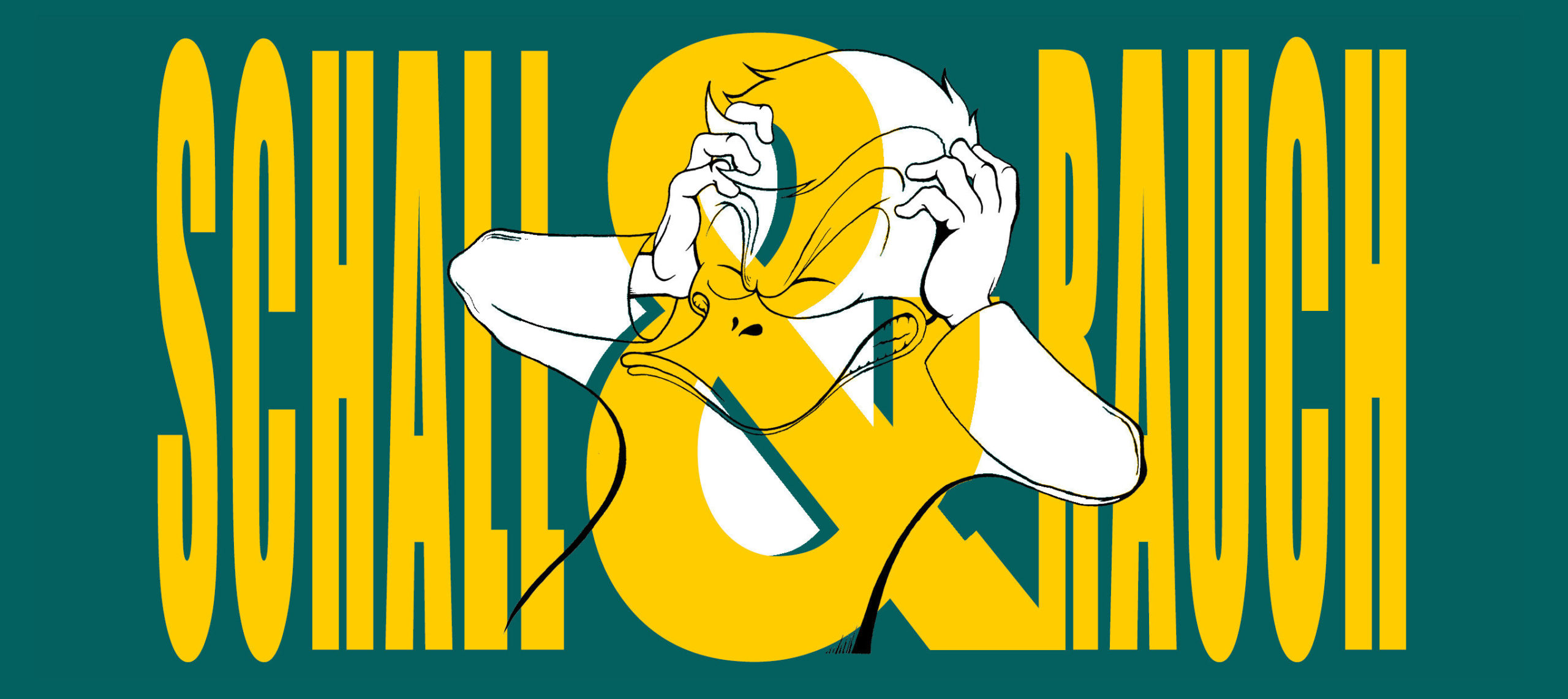
SCHALL & RAUCH
Graphic Design
2018
Graphite, Ink, Adobe Photoshop
This graphic was created to promote the commercial Schall & Rauch techno event at Café Jos Fritz in Freiburg.
While the aim of the graphic is to convey a feeling of overkill without being too serious, it depicts Donald Duck (the working-class antihero) in an uncomfortable situation.
Branding, Visual Design, Web Design, Logo Design
2017–2023 WP
subtil/skurril is a digital platform for art and literature, founded in 2017 by Fluvius Raon and myself. Conceived as a hybrid between a webzine and an online exhibition space, it serves as a curated environment for inspiration, exploration, and creative collaboration.
The visual identity balances abstraction and clarity, reflecting the core concept of Subtil/Skurril — a dynamic interplay between the subtle and the unconventional.

BROWSE SUBTIL/SKURRIL HERE
Blackwood Films
Logo Design
2016
Graphite, Ink, Adobe Photoshop
Blackwood Films is a group of award-winning independent filmmakers based in Freiburg, Germany. They’ve been sharing equipment, expertise, and a love of filmmaking since 2009.
I was part of the crew from 2014 to 2016 where I gained my first insights into filmmaking.

-> Imprint